


ยกเลิกการติดตามข่าวสาร
ยืนยัน
Loading...
Update


House decoration colours can express a variety of moods. Each colour has an effect on all feelings. White colour makes the room look bigger. Yellow colour has a stimulating effect on hunger. Green colour makes you feel relaxed. There are also cool colours, warm tones, opposite colours for selection. Thus, choosing the house decoration colour is not only choosing the colour you like but there are other factors helping with decision making.

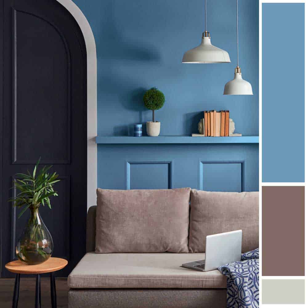
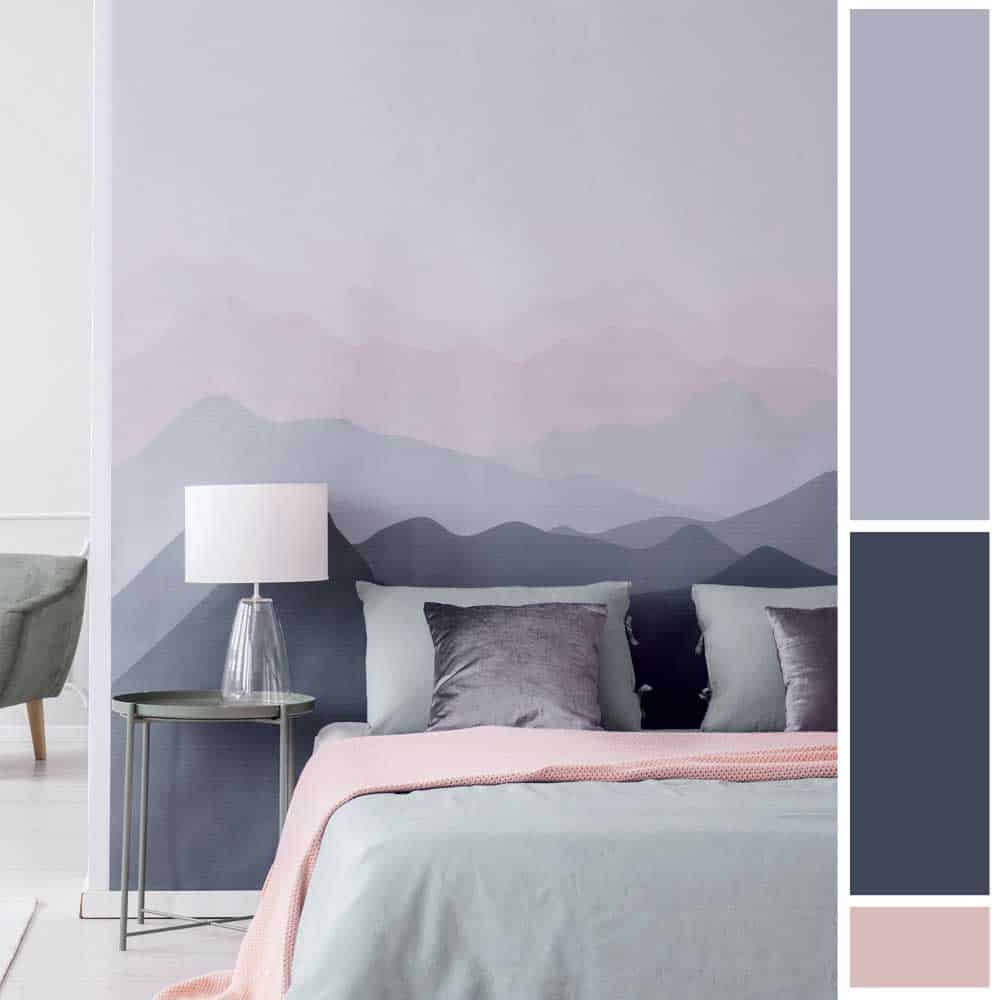
In addition, colour can also depict the style of home decoration. For example, minimalist homes tend to use white, beige, brown, which look less calm, while loft style houses tend to use dark colours like gray, brown, black, and blue, which complement the house to look cool and solemn. At the same time, the brilliance in POP ART style still communicates with bright colours such as yellow, orange, blue, and red as well. Therefore, each shade serves not only to convey feelings but also to express the style of the house more clearly.
In using colours to decorate your home to look stylish perfectly matched with furniture and other decorations, there is a formula to control the tone of the room that the interior designer chooses as a standard to match the colour percentage in the proportion of 60 30 10. It is to balance the colour and control the colour so that it does not fade and does not make the house look plain and boring. The rules for this colour match that the general public can easily follow are:
60% is for the main colour. It is the colour that is in the room with the most proportion usually in the colour of the walls and ceiling which takes up 60% of the room’s space. Mostly, soft colours like white and cream are chosen to make the room feel relaxed, light, airy and livable.
30% is the secondary colour with a smaller proportion. Therefore, it is often the colour of medium-sized furniture, curtains, carpets that are neutral tones, not too dark or too light. Most often, it is the same tone as the main colour which harmonizes the whole room.
10% is the highlight colour which is the most remarkable colour in the smallest ratio in the room. As it is the colour that makes it stand out so much, this colour that is different from the overall tone. A pair of opposite colours can be chosen to make the room stand out and look more interesting. The highlight colour is often the colour of small decorative items such as cushions, vases, pictures, etc.

One thing to keep in mind is that each room should not have more than three colours in this colour-matching principle. There are no fixed rules or restrictions on this proportion. It can be adjusted accordingly, such as 70% light colour, 20% medium colour, 10% highlight colour, or change to 50% light colour, 40% neutral colour, 10% highlight colour. If you like dark tones, you can adjust the proportion to 60% dark colour, 30% medium colour, and 10% light colour.
How to choose a colour for your beautiful home
It is not just choosing the beautiful colour that matches the whole room, the smoothness of the coloured walls is also one of the factors that contribute to the neatness of the room. The quality of the colour film is the key to have excellent adhesion to the wall, not to slip into dust, easy to be painted, no stains on the walls, and easy to clean. The problem of dirt stains which are important obstacles that reduce the beauty of the walls of the house can be reduced. What cannot be overlooked is that home paint should be safe for health to create the feeling of comfort and relaxation with fresh air as if in the midst of nature.

The skill of the painter is another important thing. Unfortunately, if we find a painter who is inexperienced in solving problems and repairing walls, it will lead to negligence and overlooking of small details that may cause major problems later whether it is the Efflorescence problem caused by the curing process of concrete or cracks that can lead to water leak stain. Thus, you should consider choosing a qualified painter to paint the right way along with choosing a good wall paint colour. The correct painting method consists of 3 major steps:
The key to keep the walls beautiful for a long time is to prepare the concrete surface to be ready for painting without accumulated moisture. It must be painted after plastering at least 28 days in order to reduce the humidity and alkalinity in the cement. The moisture value can be checked with the Moisture Meter of Kett model HI-520 to show no more than 6%. If measured by the Protimeter Mini, needle type, it will show no more than 14%. Then, the alkali value on the concrete surface is checked by using Litmus Paper. The appropriate pH value is ph 8 which is displayed on the litmus paper in green colour. Another important thing that is noticeable to the naked eye is the integrity of the wall surface, such as cracks. If defects are found, they can be repaired to reduce future problems.
For better performance of the topcoat adhesion to the concrete wall, primer painting is also the key. If it is an old cement wall, use an old cement primer water-based formula Nippon Paint Aqua Sealer. If it is new cement wall, use primer for new mortar, water-based formula Nippon Paint 5100 Wall Sealer to provide good adhesion, help preventing moisture and salt stains to the concrete wall to help covering the surface to make the paint smooth. It also prevents the topcoat from fading by applying 1 coat all over the wall.
According to the colour matching rules, the wall is the largest proportion in the room for 60%. The choice of colour tones has an effect overall. The quality of the topcoat must meet various needs. It must be beautiful, easy to clean and safe. With Nippon Paint AirCare Topcoat, harmful toxins in the air such as Formaldehyde can be absorbed. The unpleasant odors can also be absorbed. Because of odorless, you can move in immediately after applying (Zero VOCs). It also has Anti-Stain Technology with the power to enhance the adhesion of the paint film so that it can be wiped and cleaned easily helping the wall be beautiful and last longer by painting 2 coats.
Apart from matching the colours that are perfect with the colour percentage in the right proportion to make the house beautiful, painting the walls in a quality colour that combines modern technology for livable homes and the health of residents including the correct painting process are also important in prolonging the life of the beautiful walls of the house.
For more information, please contact
Facebook: Line: Website:Youtube:Tel: 02 463 1899
